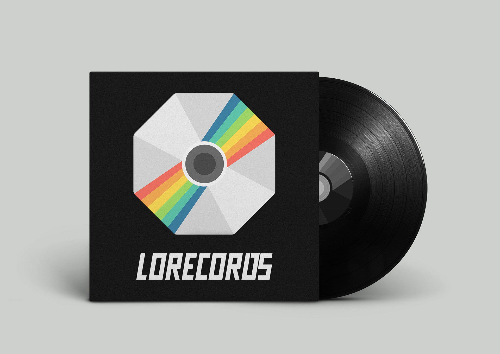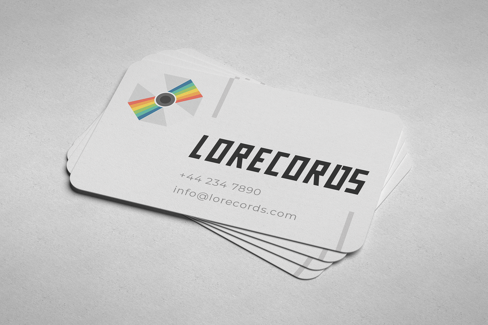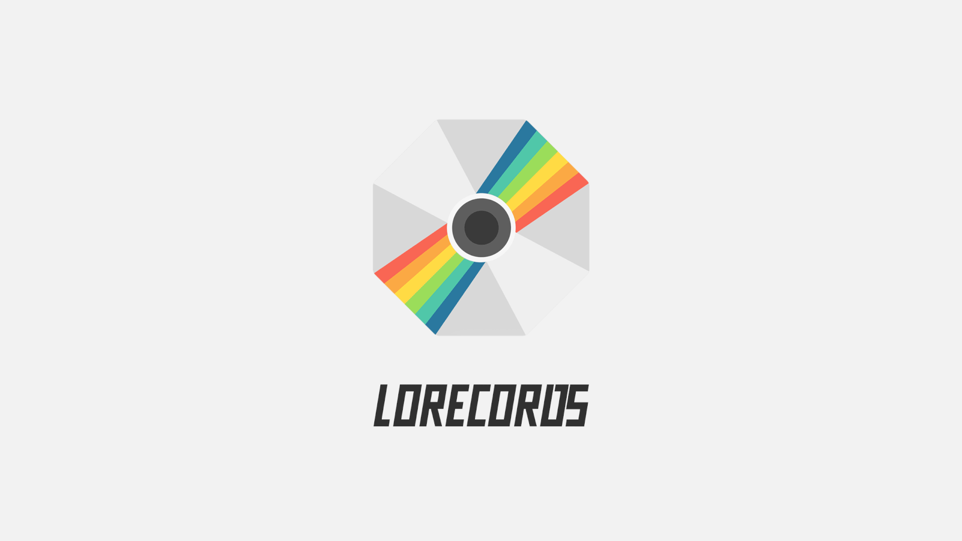
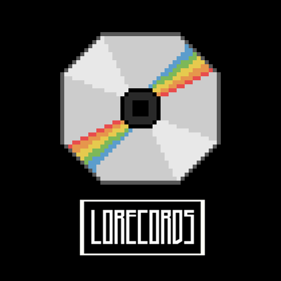
Most famous music/record label logos use detailed, complicated, sometimes even busy glyphs. I wanted to take a different approach with the LoRecords logo by taking a minimalistic approach with a simple, yet noticeable icon.
Source: Insight Report / Google
The goal was to create a logo for the underground music scene with a minimalist approach. Most underground scenes generally use a form of graffiti as an expression of their style, however I wanted this logo to stand out and look more professional. With this in mind, I experimented with a selection of sketches, mocked up a few designs to choose from but finally landed on a simple octagonal disc logo with a rainbow reflection and bold font, thanks to the client's feedback.
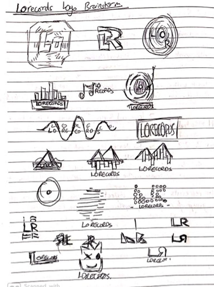
Selection of sketches for logo mockups
Early logo drafts


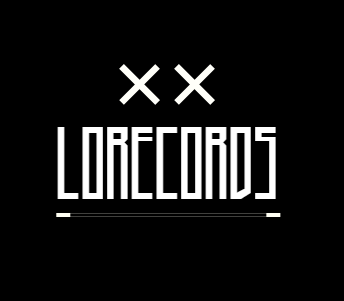
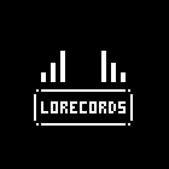
Logotype

The font selected is called 'Tekno', chosen due to the client's choice of wanting condensed yet bold enough text for the title. Below are some mockups envisioning the logo with different use cases.