Designing a logo for a beauty / makeup brand
As a beauty and makeup business, the logo will be used mainly on social media and on mediums such as business cards or posters. Therefor it was essential that the logo be as simple as possible, yet versatile to use on different platforms such as the front of clothing, packaging or even future merchandise.
Within a competitive market for makeup artists, each with their own logo, this logo also needed to be unique and identifiable to ensure her new business would have the best opportunity to be memorable and grow. This meant finding designing the perfect logo, taking it up as a creative challenge.
Researching to find a unique identity
During the design phase, searched for photos and created a mood board of similarly designed make up logos, pieces and beauty products. Using this, several drafts were designed and shown to the client, who then narrowed down the wanted design to be an initials word mark with the full name shown too.
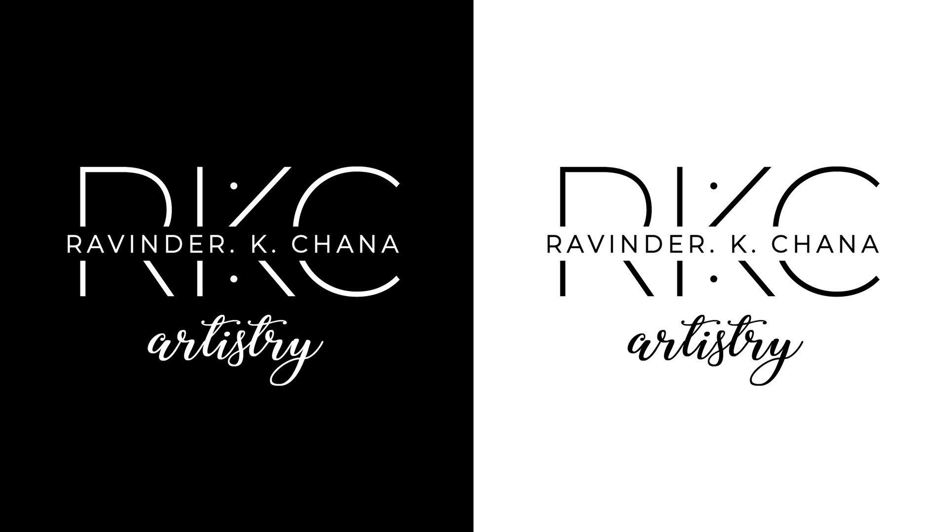
The initials 'RKC' were tested with different fonts, until a preferable one was chosen (with the client's choice taken into account). The full name was then inserted into the middle, through the large letters for a more modern approach. Dots were included in the 'K' for a unique approach.
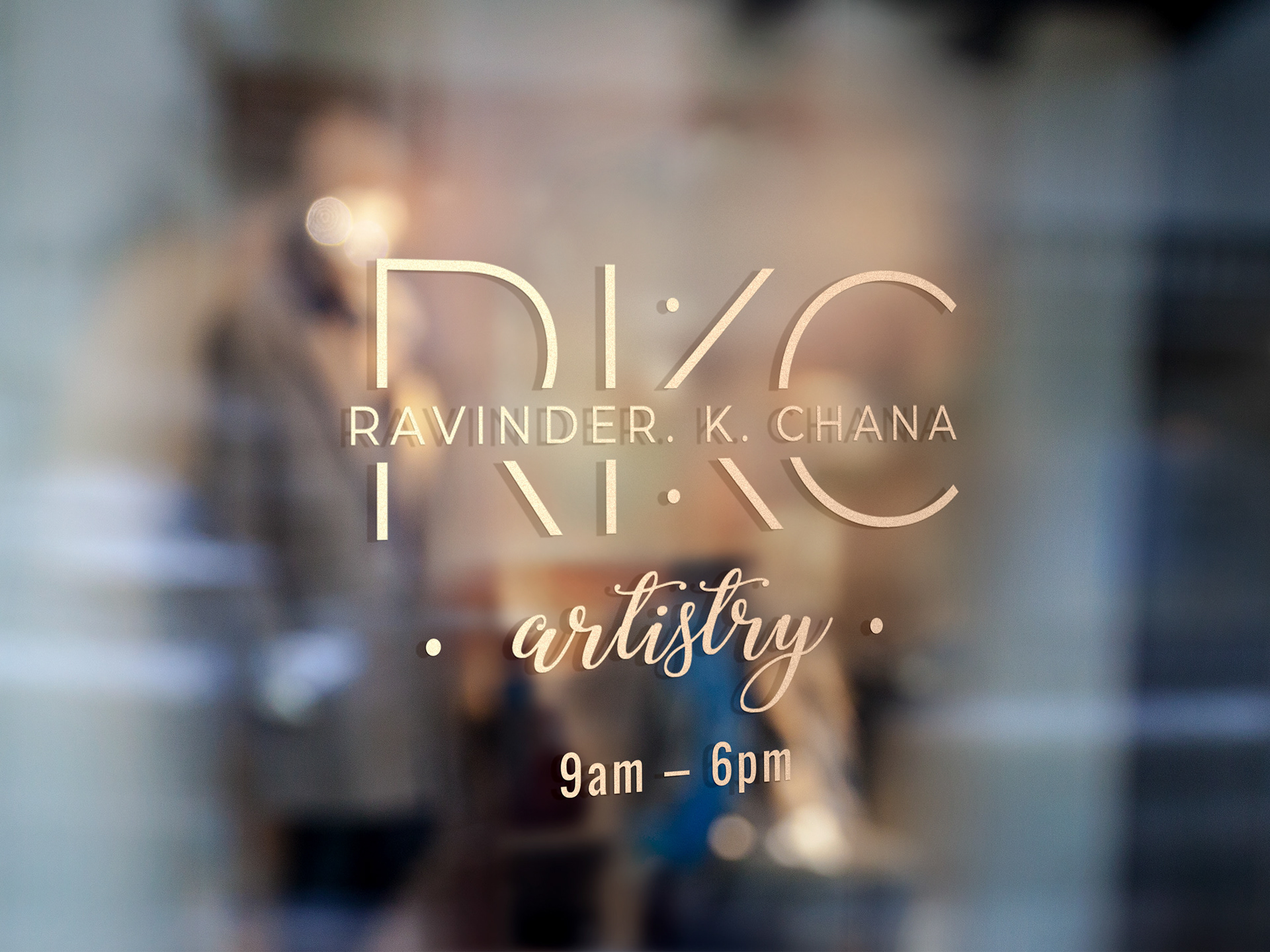
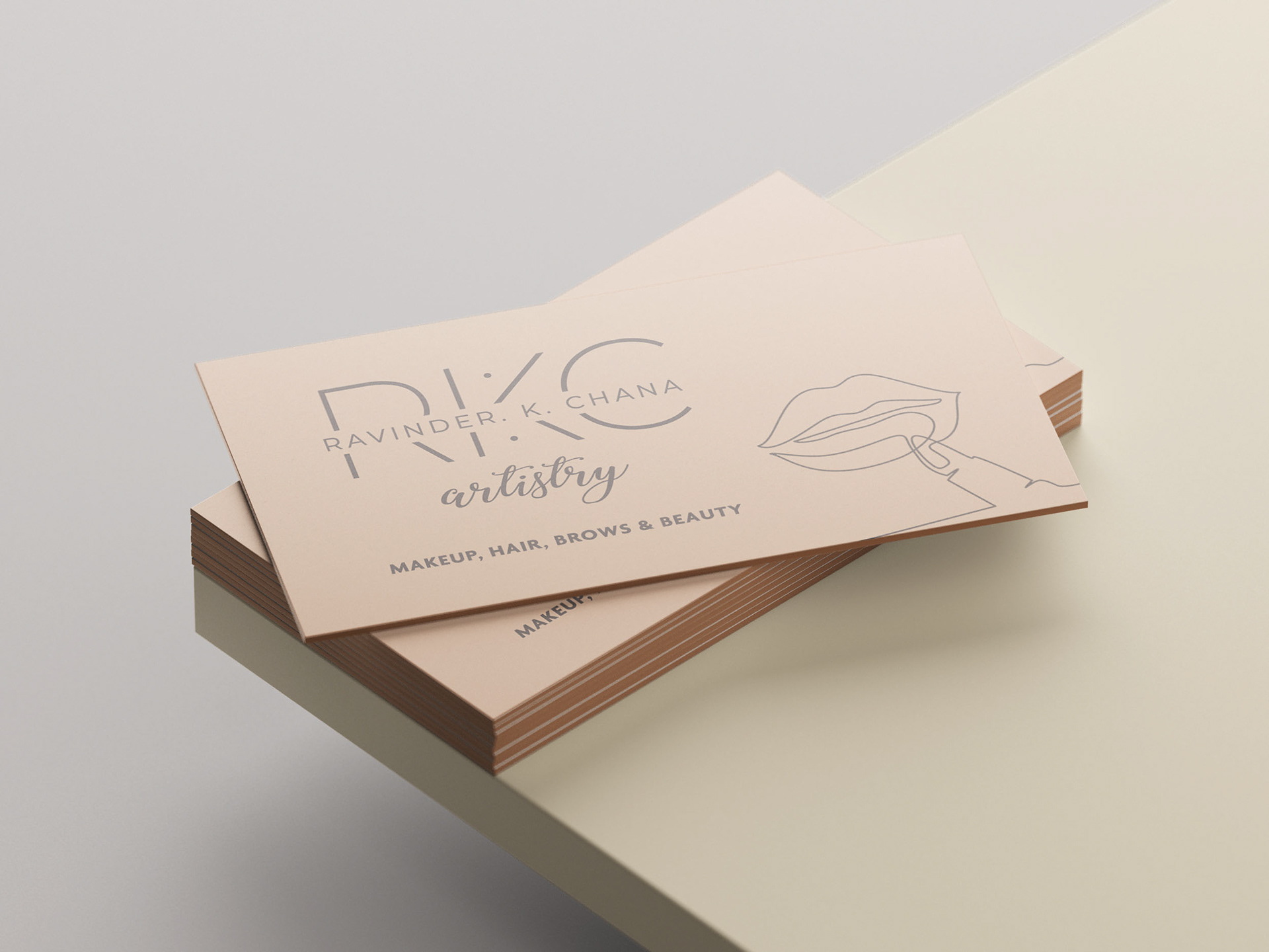
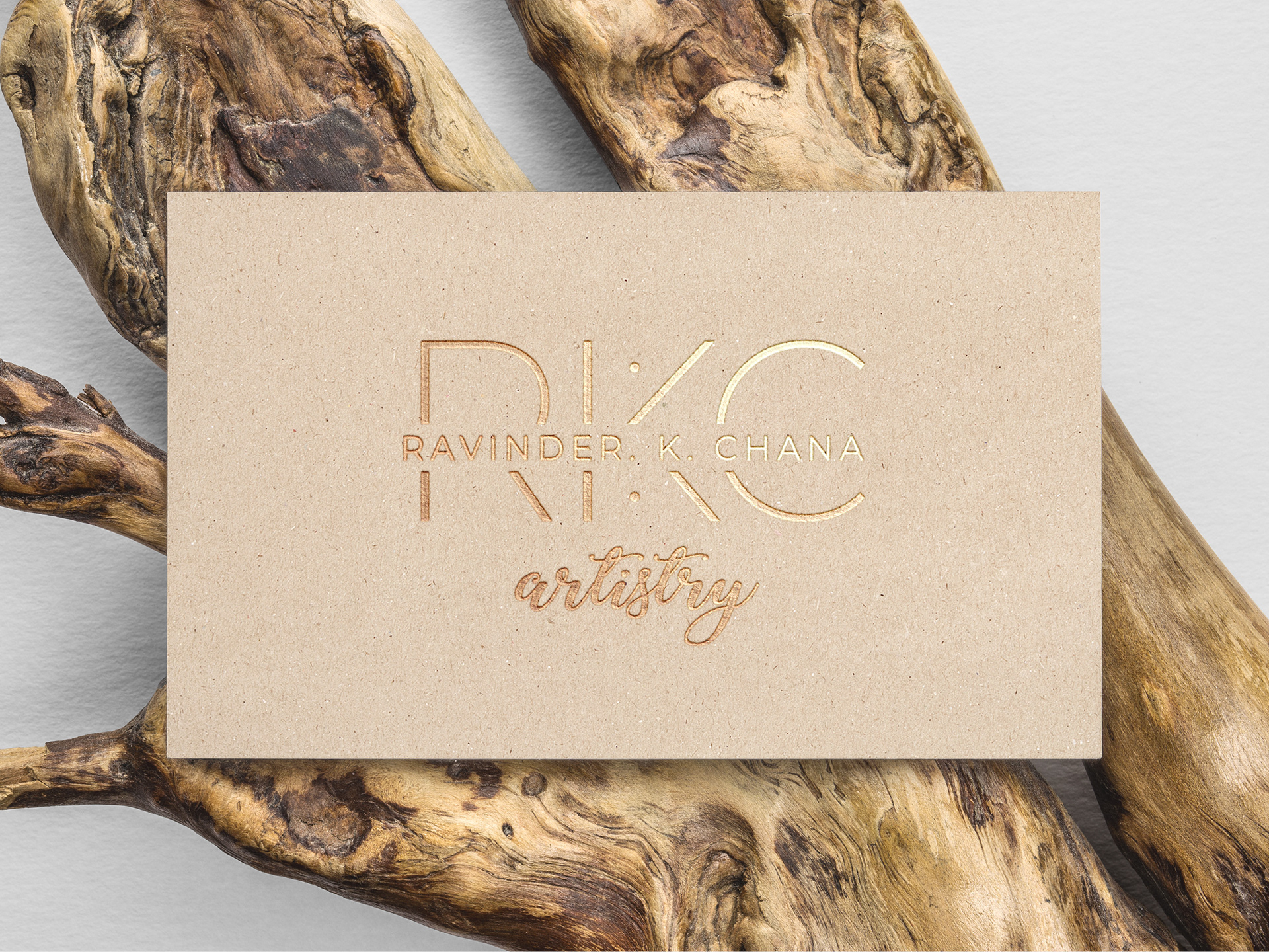
Not only is the final solution a meaningful representation of the initials used in a modern word mark, but the combination of the lower 'artistry' script typeface makes this design look stylish, and also uniquely modern and identifiable. This allows the client to start posting on social media and differentiate from other make up artists in the business.